
Nooklyn
A love letter to New York City.
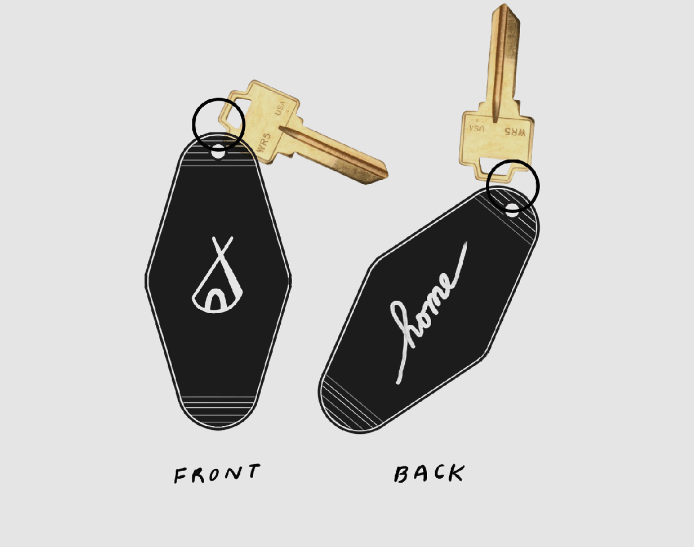
For Nooklyn, we were inspired to create both a wordmark and a symbol. The wordmark and symbol remain can be used together or independently and are both instantly recognizable as Nooklyn.
We crafted a custom set of icons called Nookons. The icons appear in 3 size classes, from small, medium to large. Nookons-SM features hundreds of icons for all the unique housing-related symbols — everything from amenities to transit options. The larger sizes introduce depth and color to take advantage of the bigger canvas.
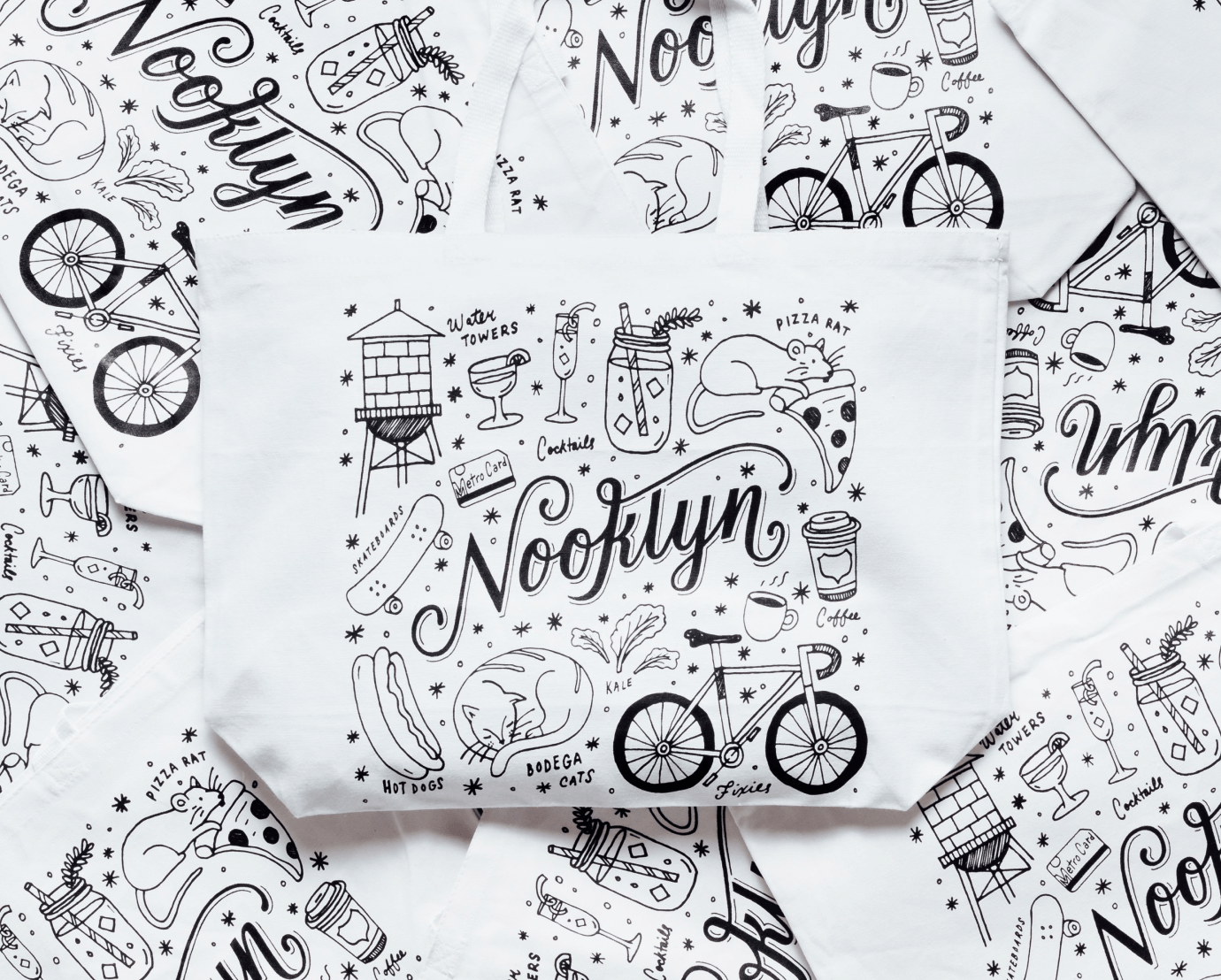
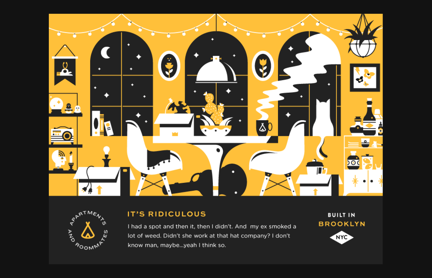
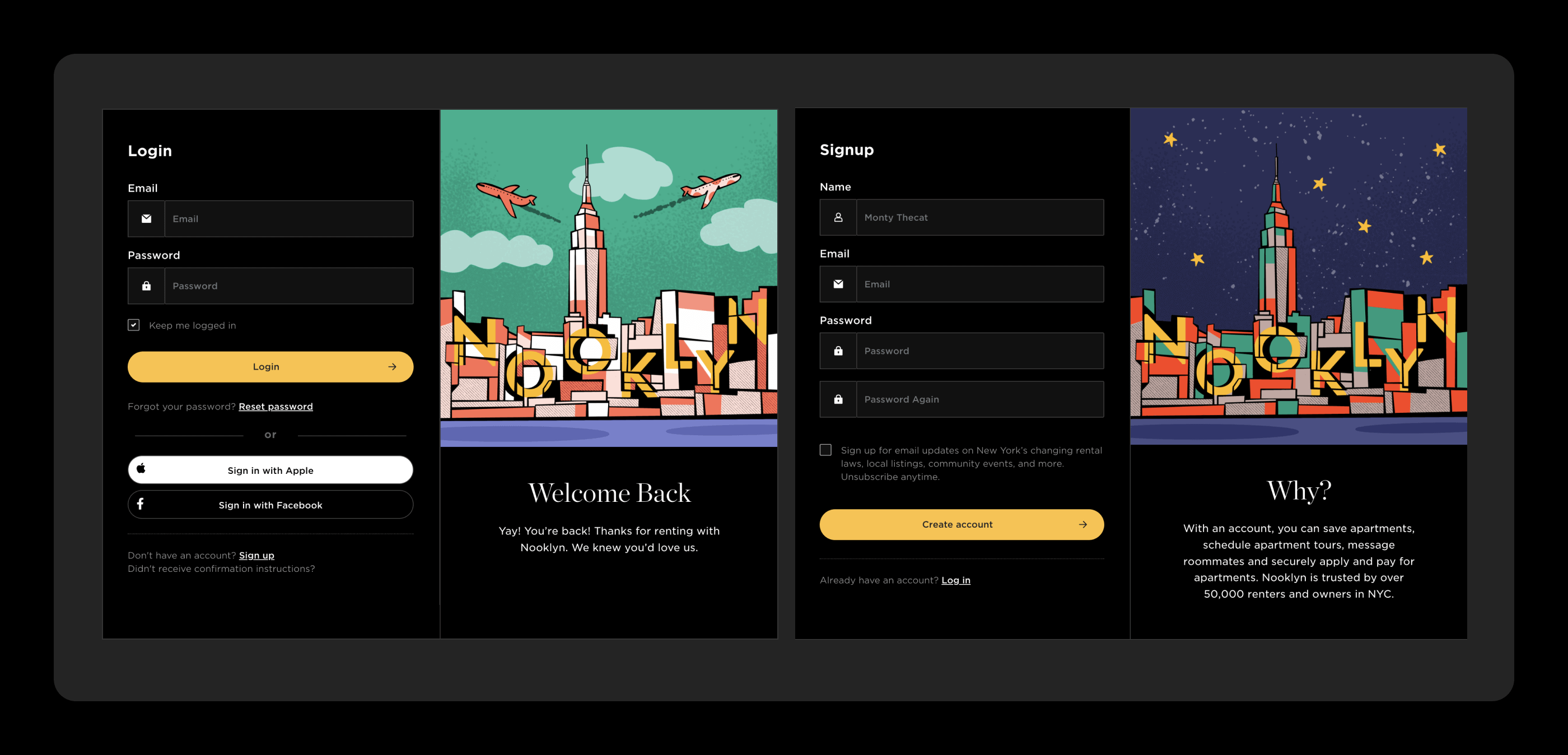
Real estate always appears intimidating to renters. By creating illustration styles that seem playful and approachable, we made Nooklyn the friendly option. Additionally, since photography is a critical part of the product (listing photography), brand illustrations better explain an otherwise complicated process.
For typography, we identified Gotham, a geometric sans-serif designed by Tobias Frere-Jones, as the ideal choice. Gotham is steeped in the history of New York City. It is based on the letters throughout the city's signage, from buildings to advertisements. We coupled Gotham with Chronicle, a delicate serif that elevates a brand to a luxurious feel.
A Map Centric, Searchable-Magazine
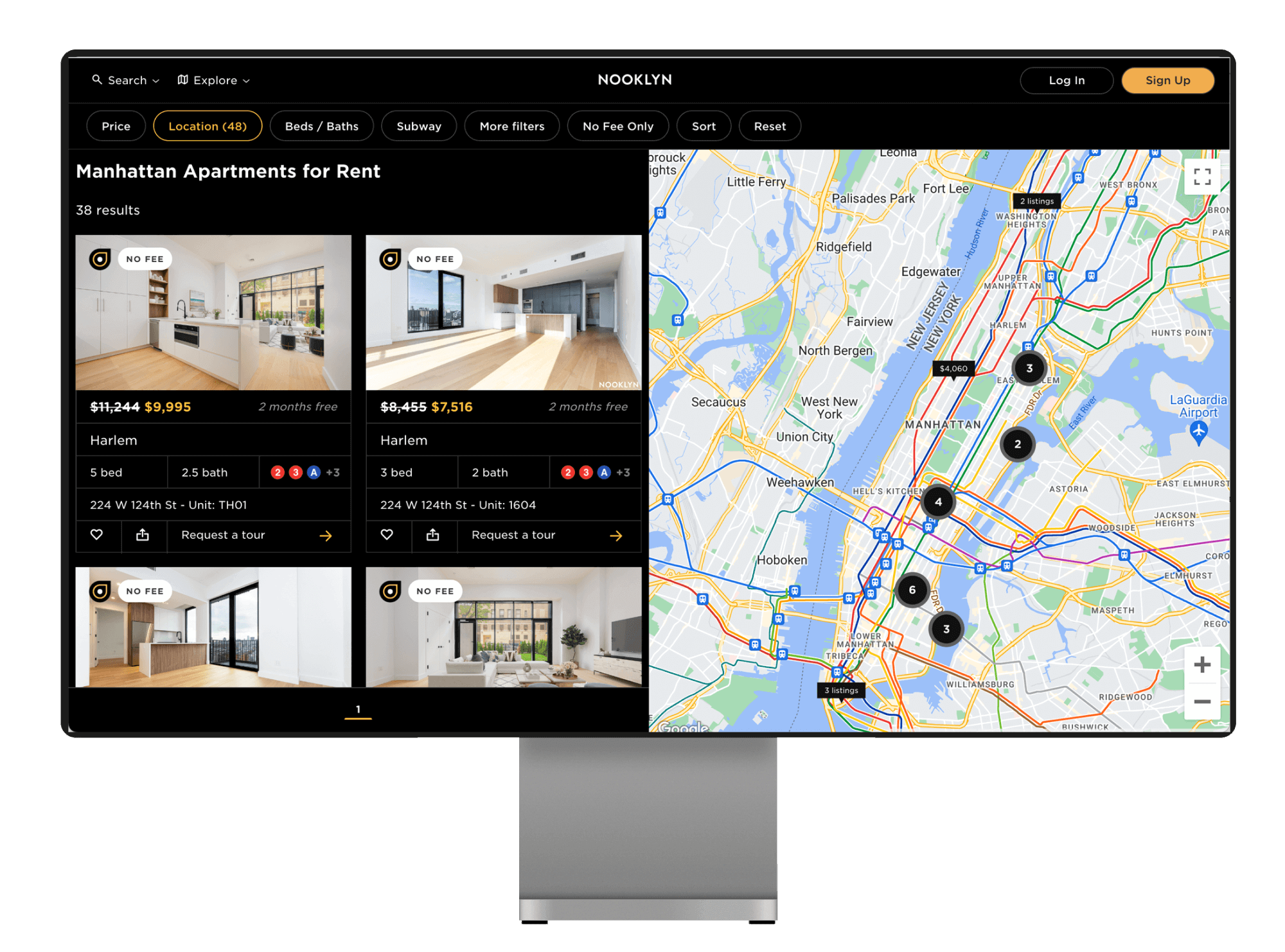
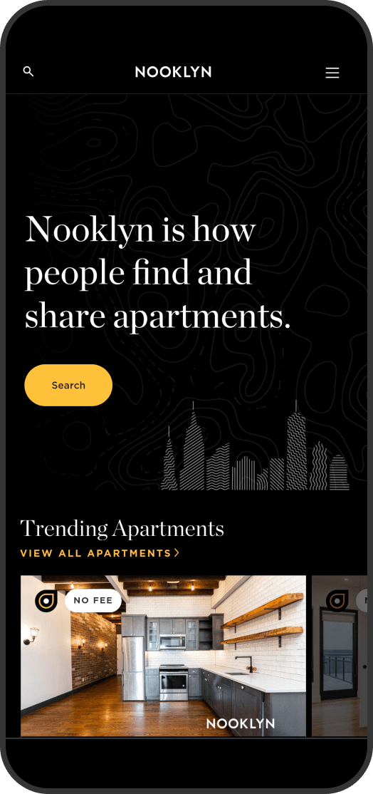
Nooklyn always put the map front and center. People choose their next apartment based on location, so we should embrace that. In a time (2013) when most websites hid the exact location, we embraced it.
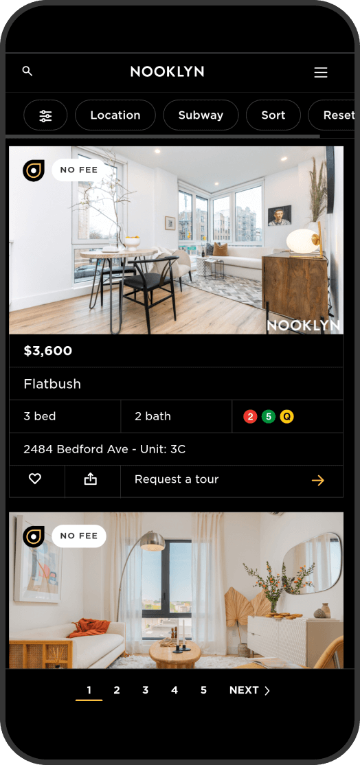
In addition, Nooklyn Search has been used millions of times by renters. Our filters include the standard, but go much beyond that to include filtering by Subway Stop not just line. This focus on unique features that New Yorkers would want is why Nooklyn one the Webby for Best Real Estate website.
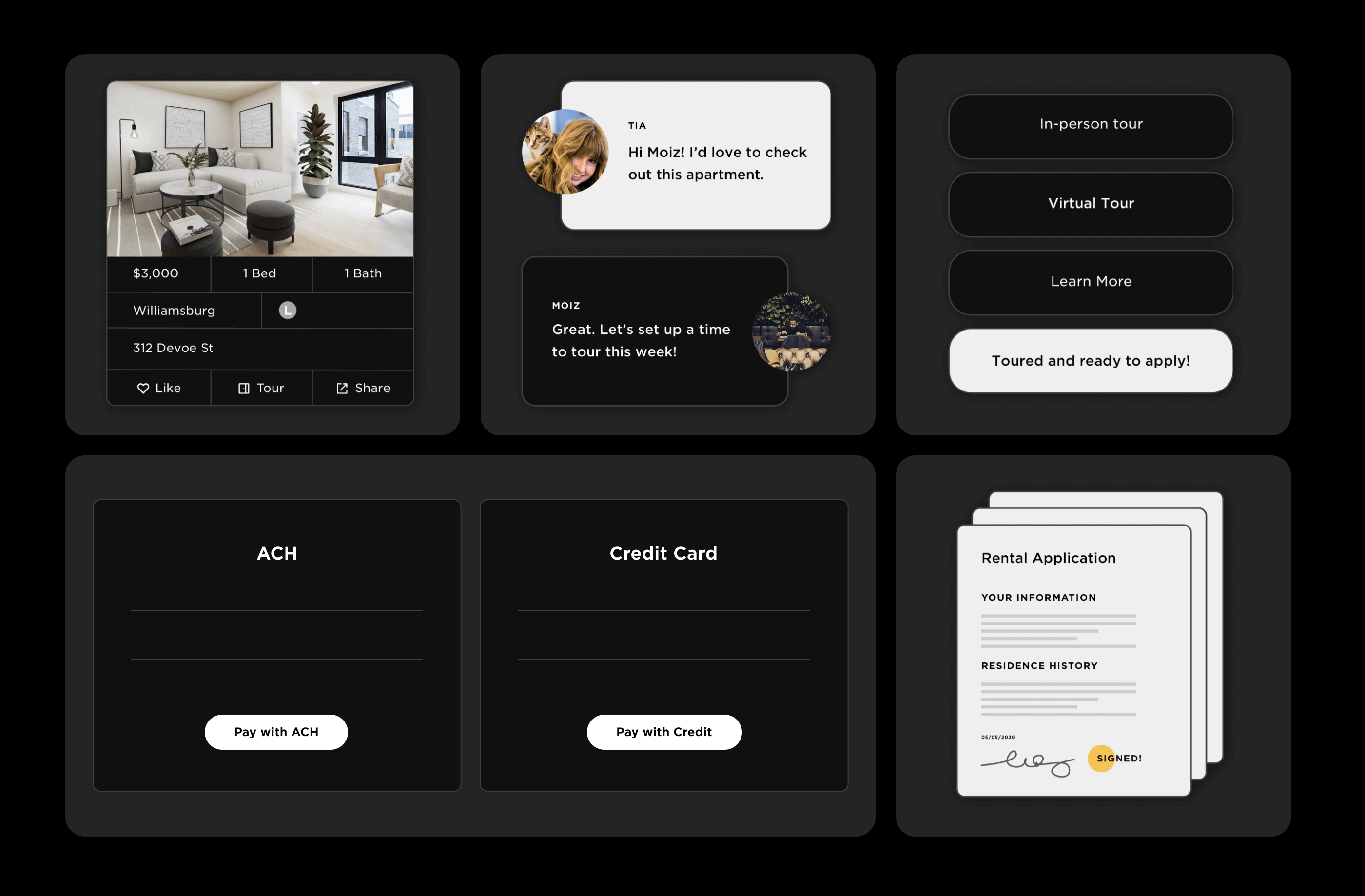
An odd aspect of most real estate websites is they abandon you half-way during your search. As soon as you find a place you might like, they don't help you anymore. Nooklyn, on the other hand guides the renter through the entire process from searching, touring, applying, to finally signing their lease. This sets Nooklyn apart to be the only service that takes a renter from end-to-end of the process.
Digital Marketing with Physical Presence
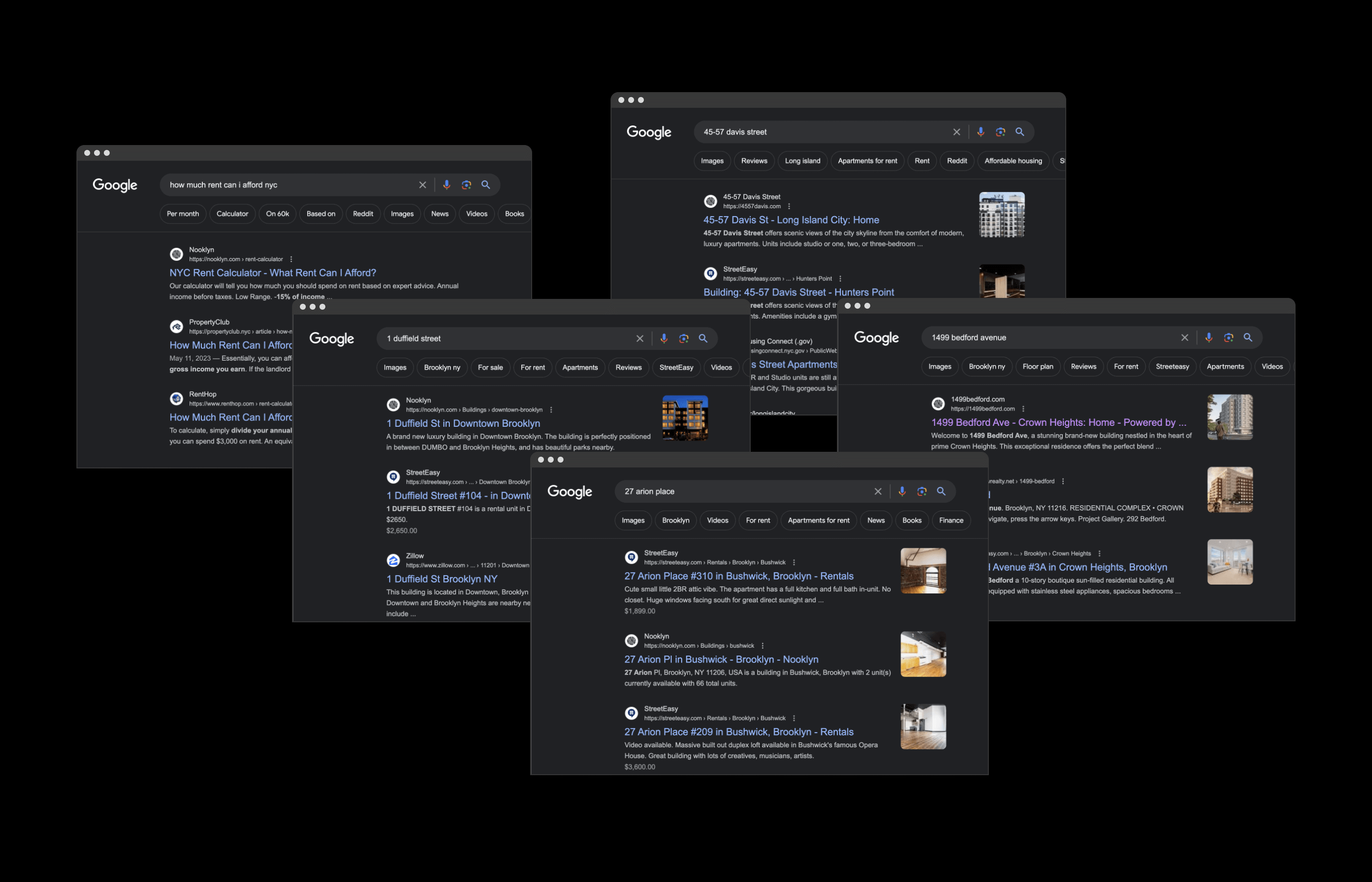
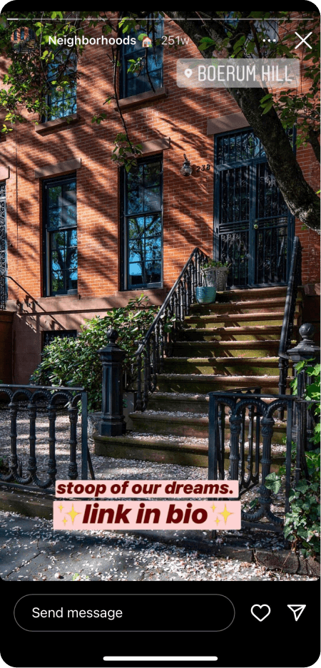
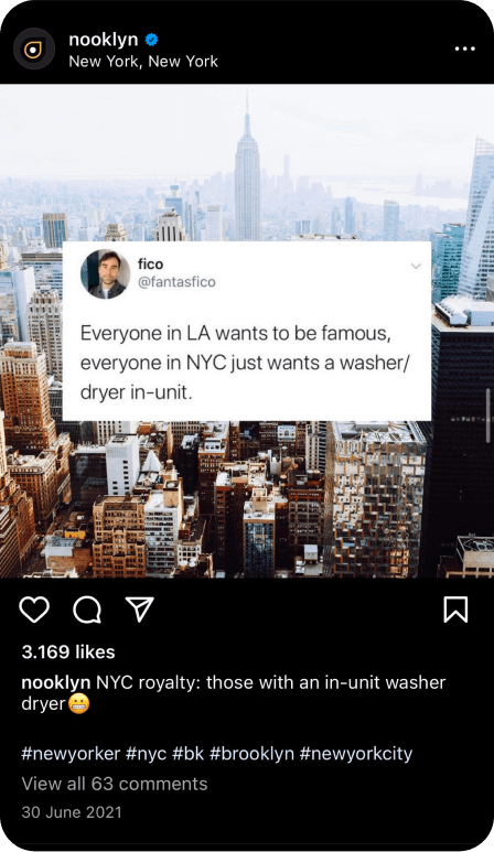
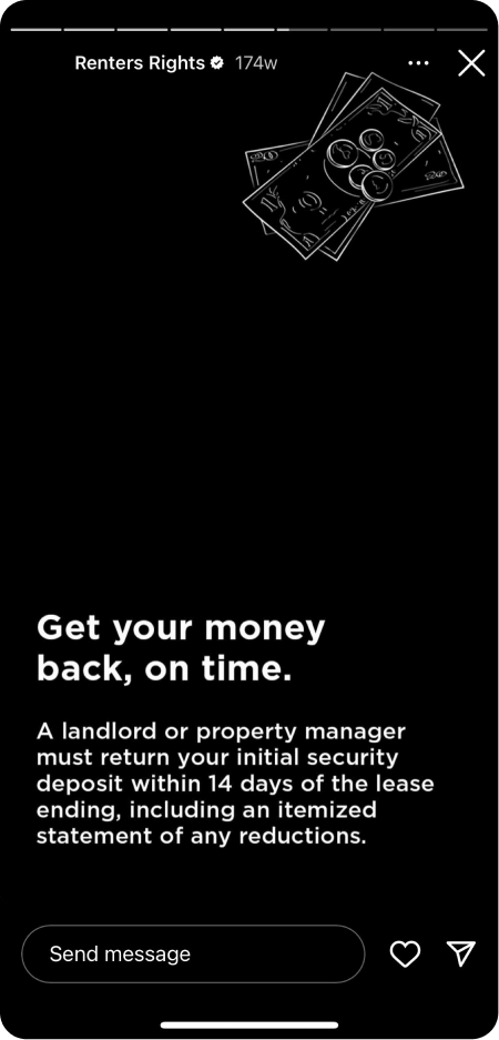
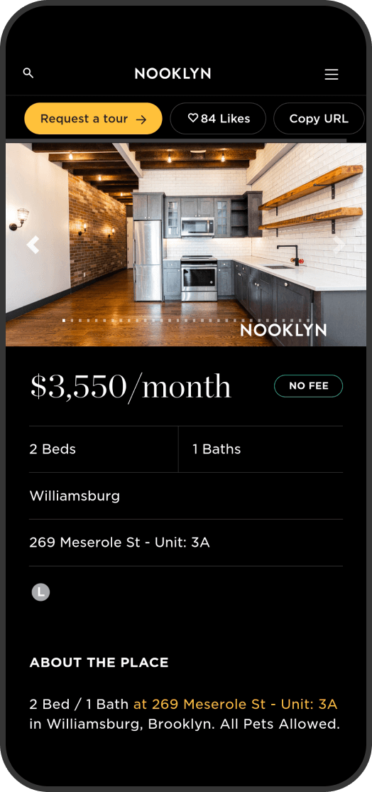
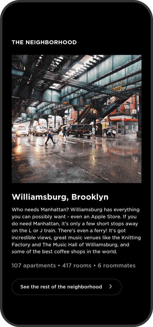
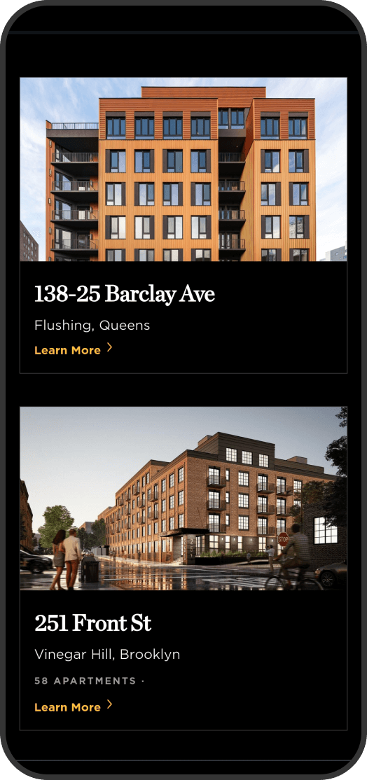
Nooklyn is the scrappy upstart from Bushwick, Brooklyn. Lacking the massive ad budgets of our competitors, Nooklyn had to succeed with free methods like SEO and content. So we identified a strategy of creating useful landing pages such as NYC Rent Calculator and a webpage for every single property we have in Brooklyn and Queens.
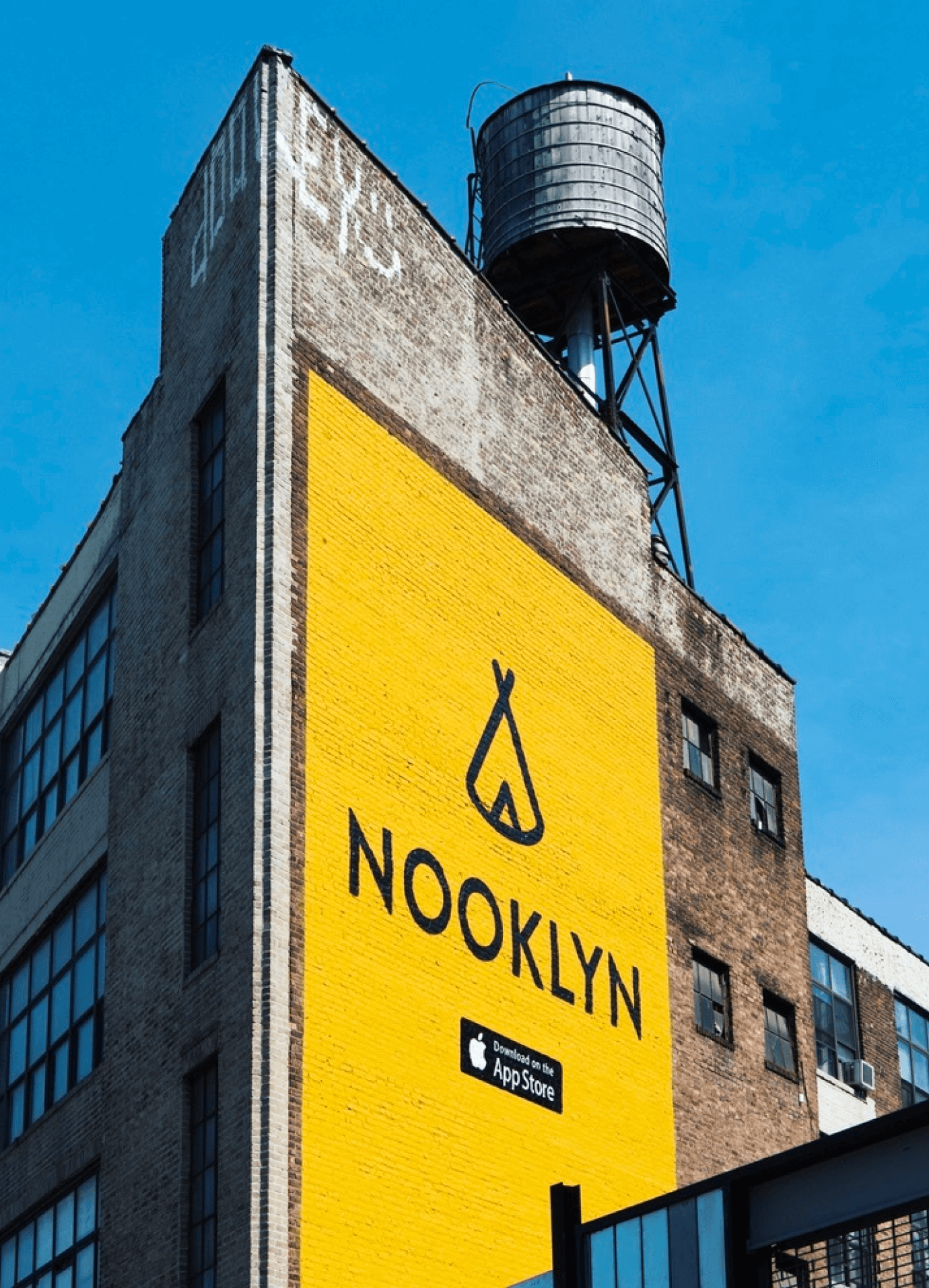
In addition, we've created iconic clothing and ads by partnering with local artists. Everything from t-shirts to totebags to 40-ft OOOH ads. Nooklyn's marketing is an omnichannel focus to attract all New Yorkers.
