
The Exchange
The property is in a Historic Landmarks Preservation District and has Landmark status. One block from the vibrant Fulton Street restaurants and shops, yet still quiet and focused for work, the property is truly one of a kind in central Brooklyn.
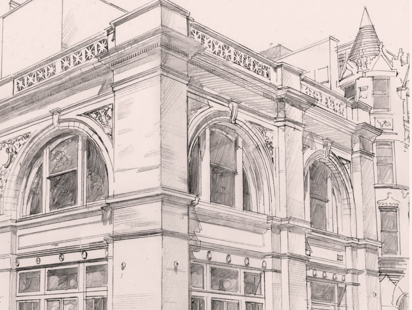
The building used to function as the New York Telephone Exchange was built next door to the NY The beautiful two story building with grand Romanesque arches designed by Rudolf Daus in 1890, used to function as the New York Telephone Exchange till 1938. We merged the previous purpose of the building with the concept of communication and neighborhood to name the building The Exchange.
The name of the building pays homage to the building's rich history while also providing a clear sense of direction for the future.
Creating a Brand Identity for a Historical Landmark
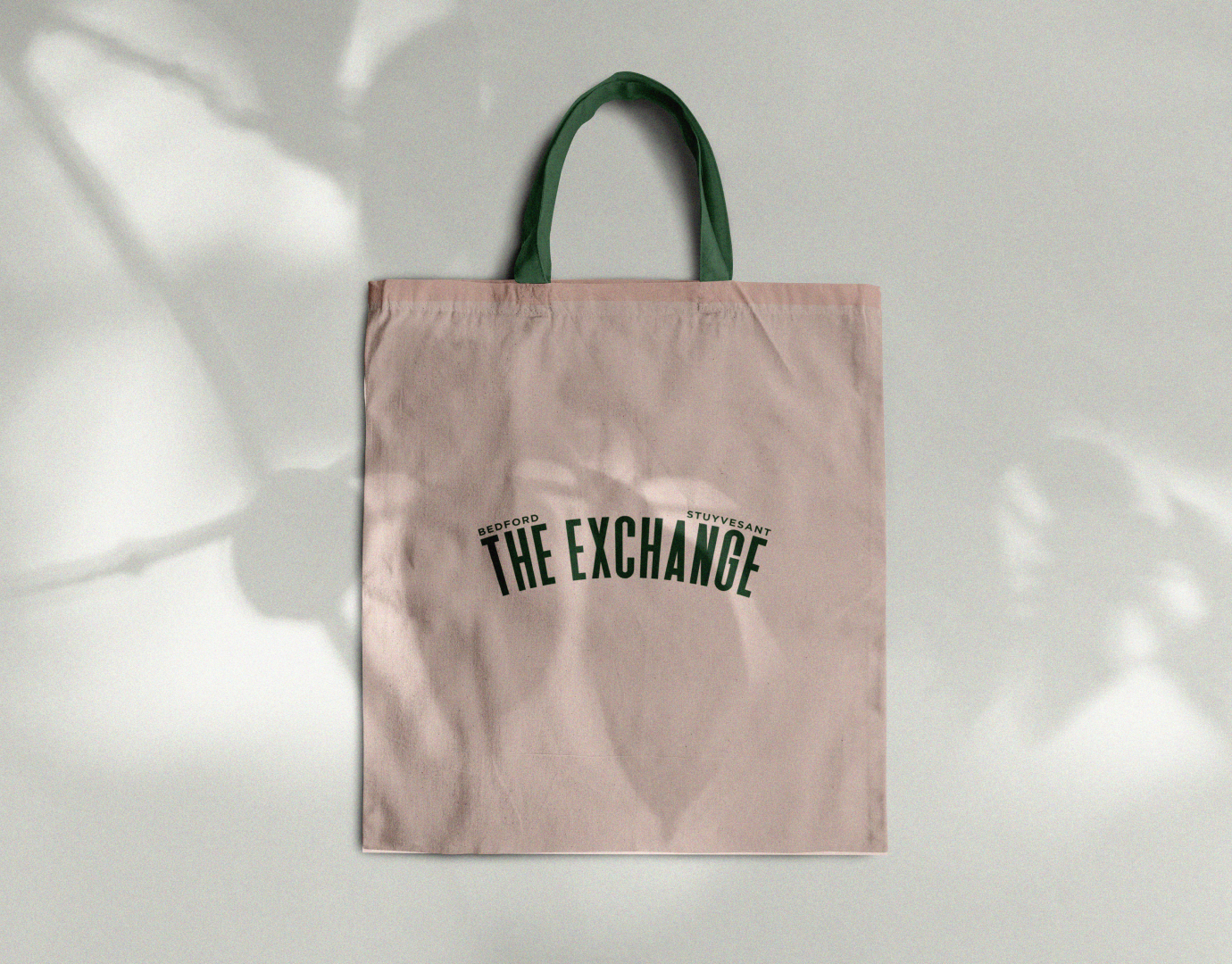
We encapsulated the property's heritage through various designs & explorations that resulted in the single, most suitable craft treatment for the building's logo.
A strong, memorable theme is the essence of branding. We carefully studied the building's unique features and finishes to create a coherent identity that speaks to its distinct character. To weave together a compelling narrative that combines the building's interior design and the lifestyle it offers, we delved into understanding our renters' preferences and lifestyle aspirations.
In our quest to differentiate The Exchange and set it apart from the competition, we introduced a series of playful illustrations into our design language. These illustrations accentuate the brand's distinctiveness and infuse it with a friendly and approachable personality, making it more appealing and inviting to potential residents.


Building an immersive online presence for The Exchange
Starting with the architectural drawing of the building, complemented by animated leaves, the building's trademark, we crafted a fresh, modern first impression that immediately engages the user and reflects the property's aesthetic.
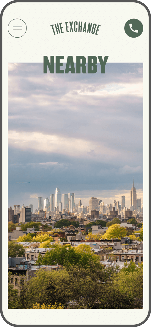
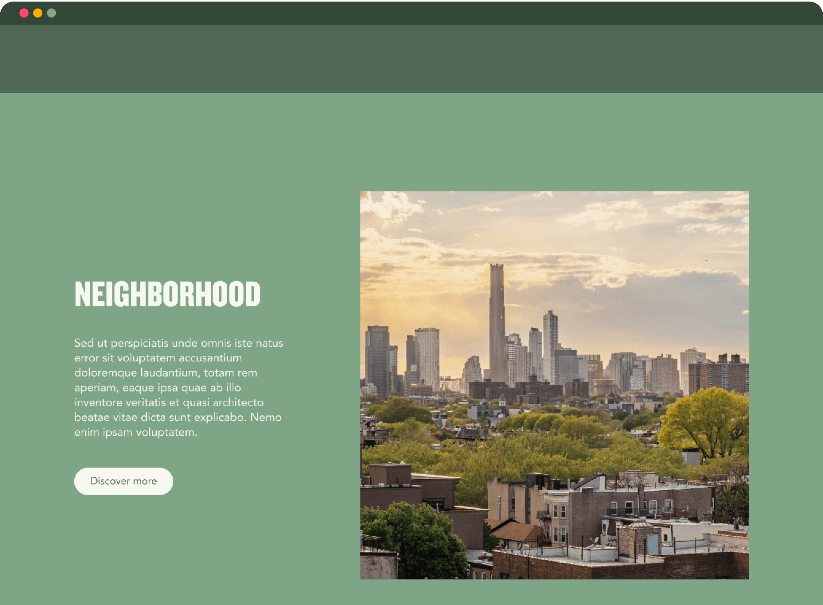
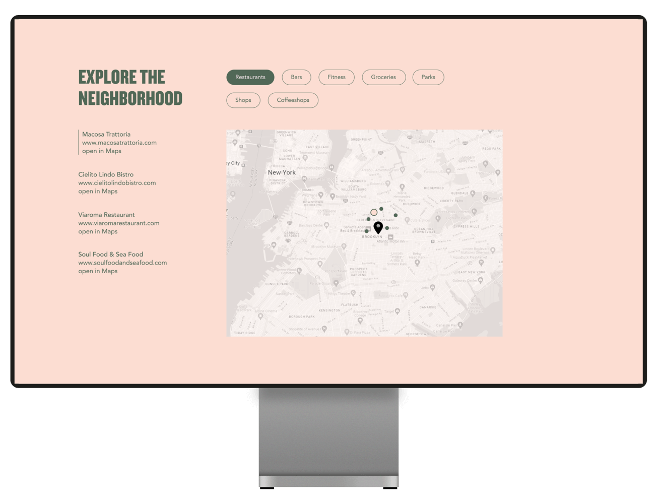
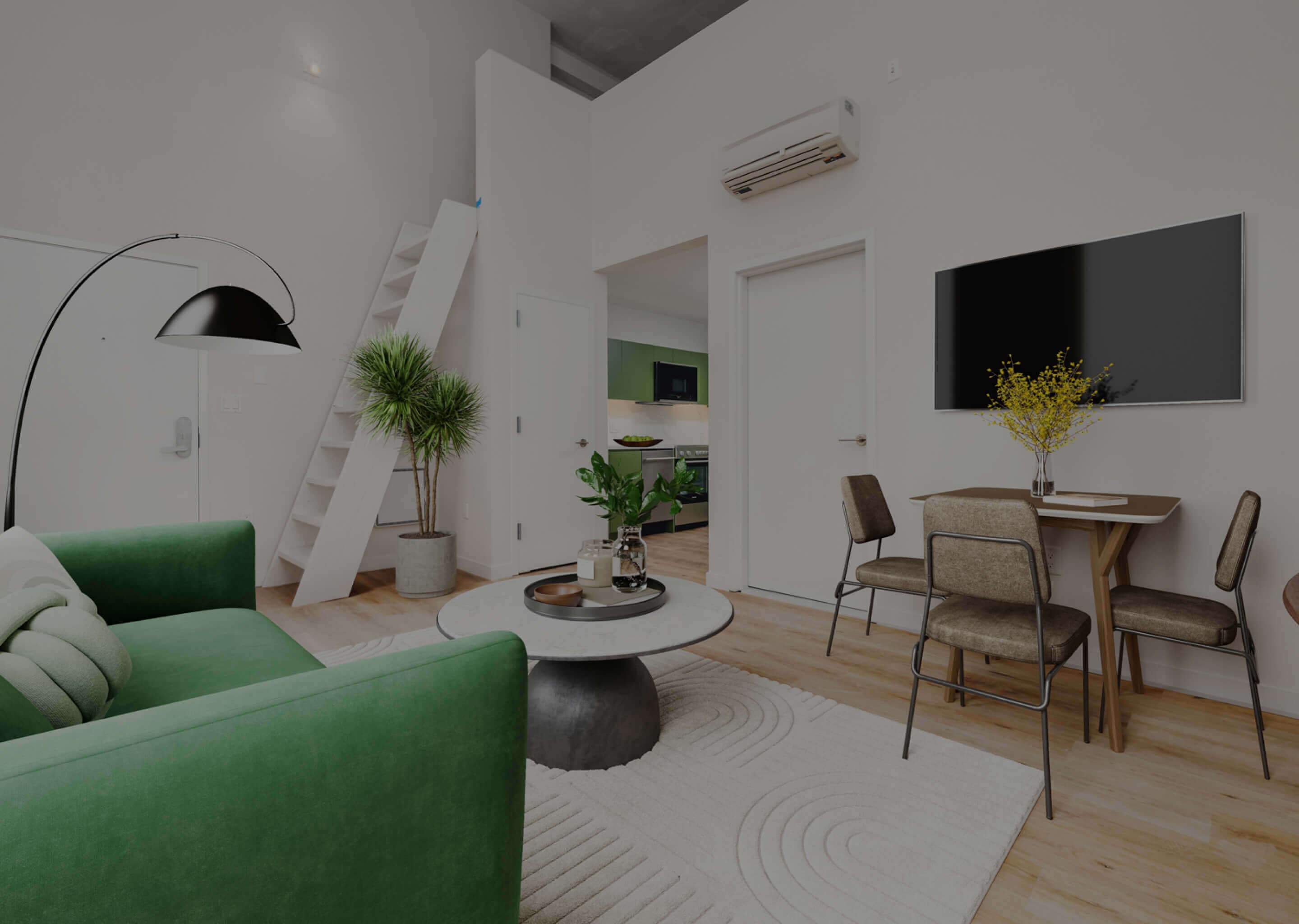
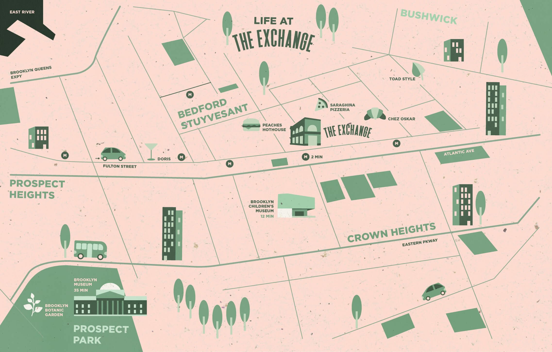
The website integrates an intuitive user interface with filters to accommodate home research, enabling users to narrow down options based on their preferences, such as price, floorplan layout, and apartment-specific features. The neighborhood page employs the same concept, allowing users to explore the area around the building and easily discover what the neighborhood has to offer.
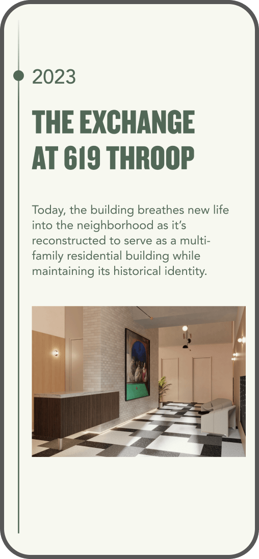
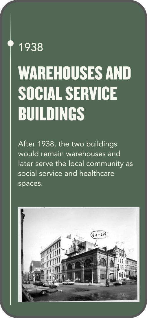
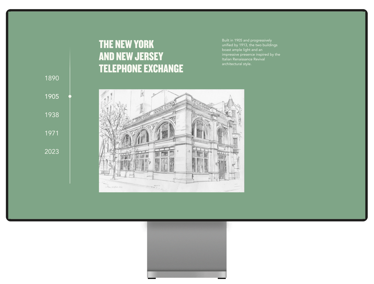
To highlight the significance of the building's history and distinguish it from others, we have created a page that focuses on showcasing its rich heritage. This page features a timeline designed to present significant dates and events that have influenced and shaped this landmark.
