540 Atlantic
Project Overview
Year
2025
Designers
Lemonia Micha / Web Design
Odysseas Pantaoulas / Branding
About
We were recently commissioned to shape the brand strategy, identity & website for The Baltic Canal—a property located near the industrial Gowanus Canal. We drew inspiration for the name from the canal as well as the building’s location on Baltic Avenue.
Mission
Our mission was to create a powerful and engaging user experience that sets Hillside apart. We aimed to create a powerful brand that through strategic storytelling positioned Hillside Tower as the top choice for living in the area.

BRAND IDENTITY
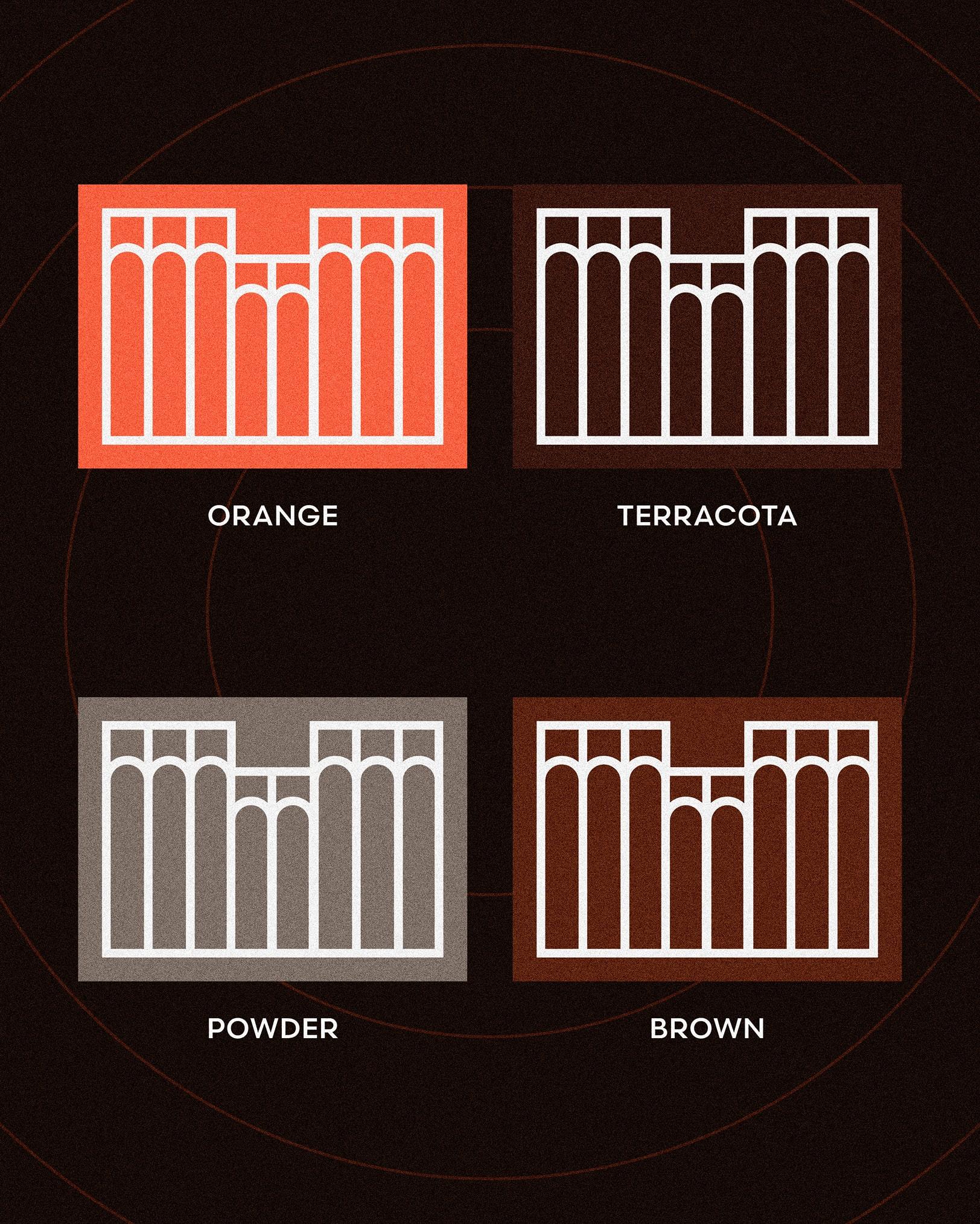
The Facade as the Brand Foundation
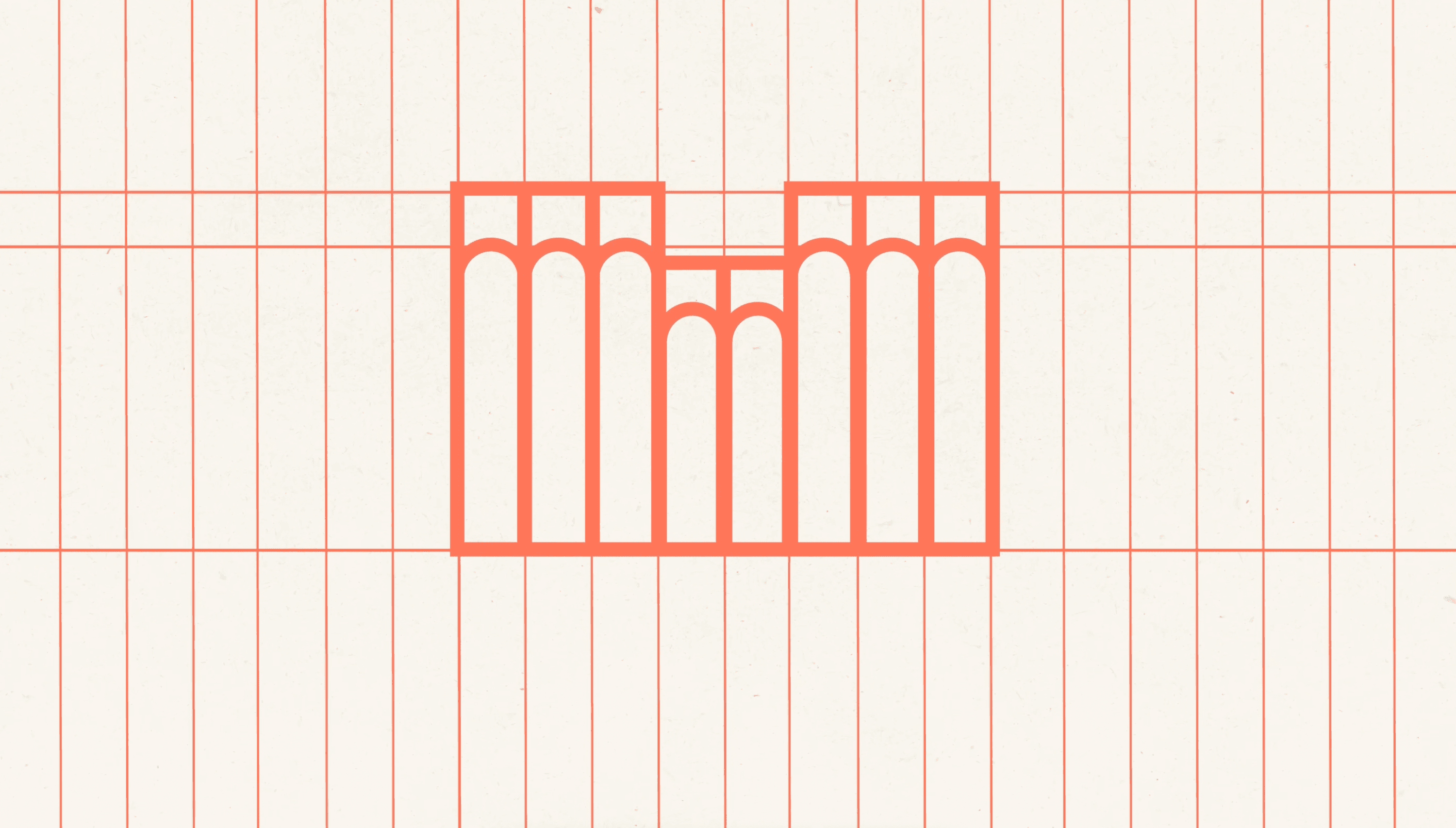
The building’s form rises from grounded, vertical lines to arches that lift skyward. This architectural rhythm informed our approach, inspiring a confident, streamlined mark that scales easily across all expressions of the 540 Atlantic brand. The colors span the spectrum, pairing a vibrant orange with deep reds and sophisticated grays.
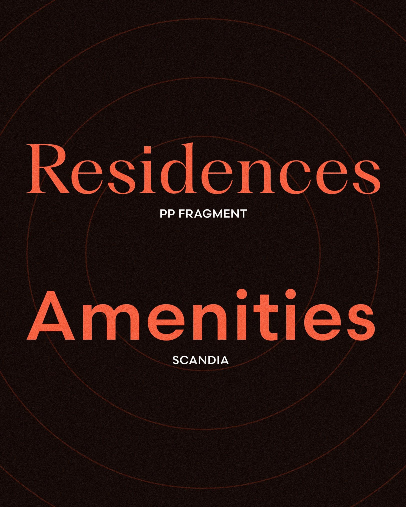
BRAND IDENTITY
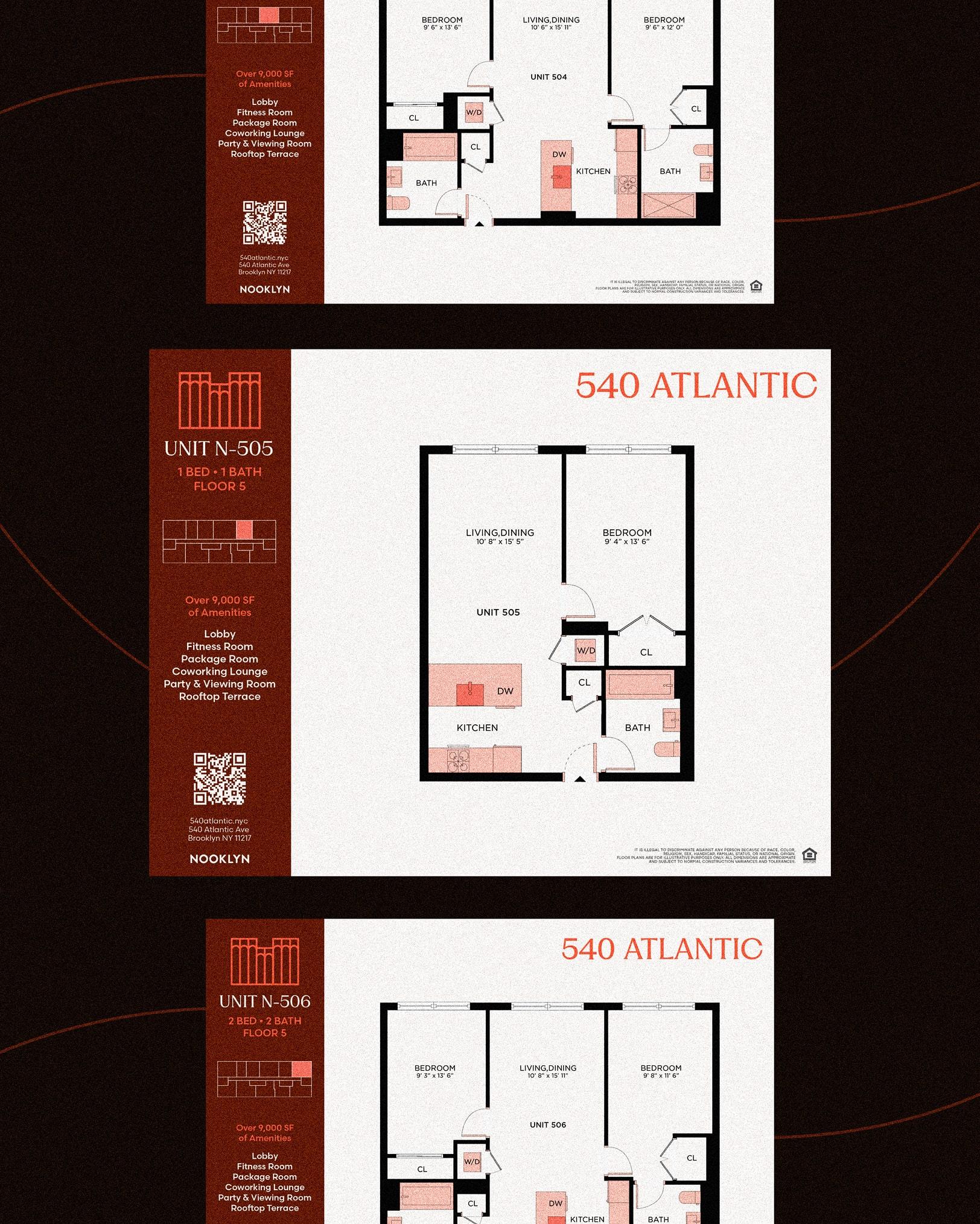
540 Floorplans
We designed and produced custom floorplans for every apartment, using the same brand language and visual aesthetic. With key branding elements and 540’s colors—vibrant orange and muted dark red—the floorplans feel warm and inviting, letting future residents imagine life at 540.

WEB DESIGN
Warmth as a Brand Touchpoint
From the resident handbook to promotional materials, warm colors like red and orange take center stage. These deep reds reinforce the brand experience and make 540 Atlantic truly stand out in Brooklyn.
WEB DESIGN
8 Reasons to Live Here
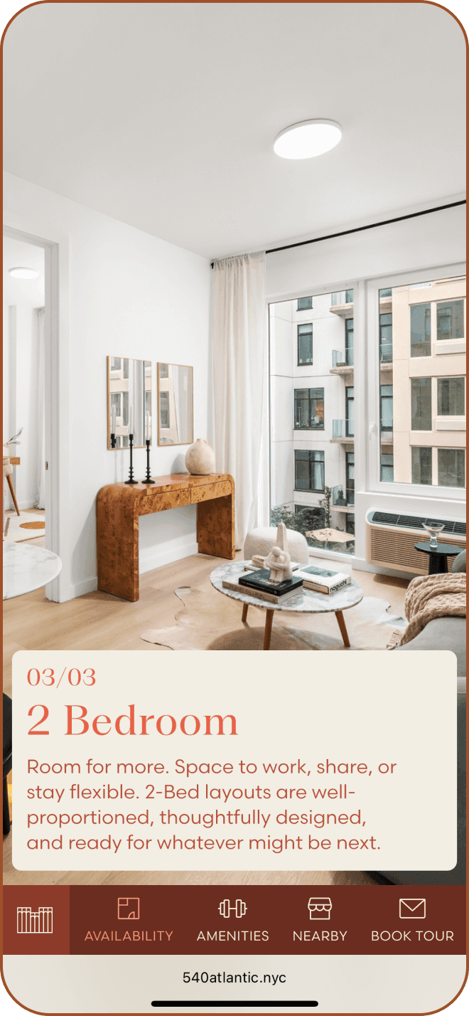
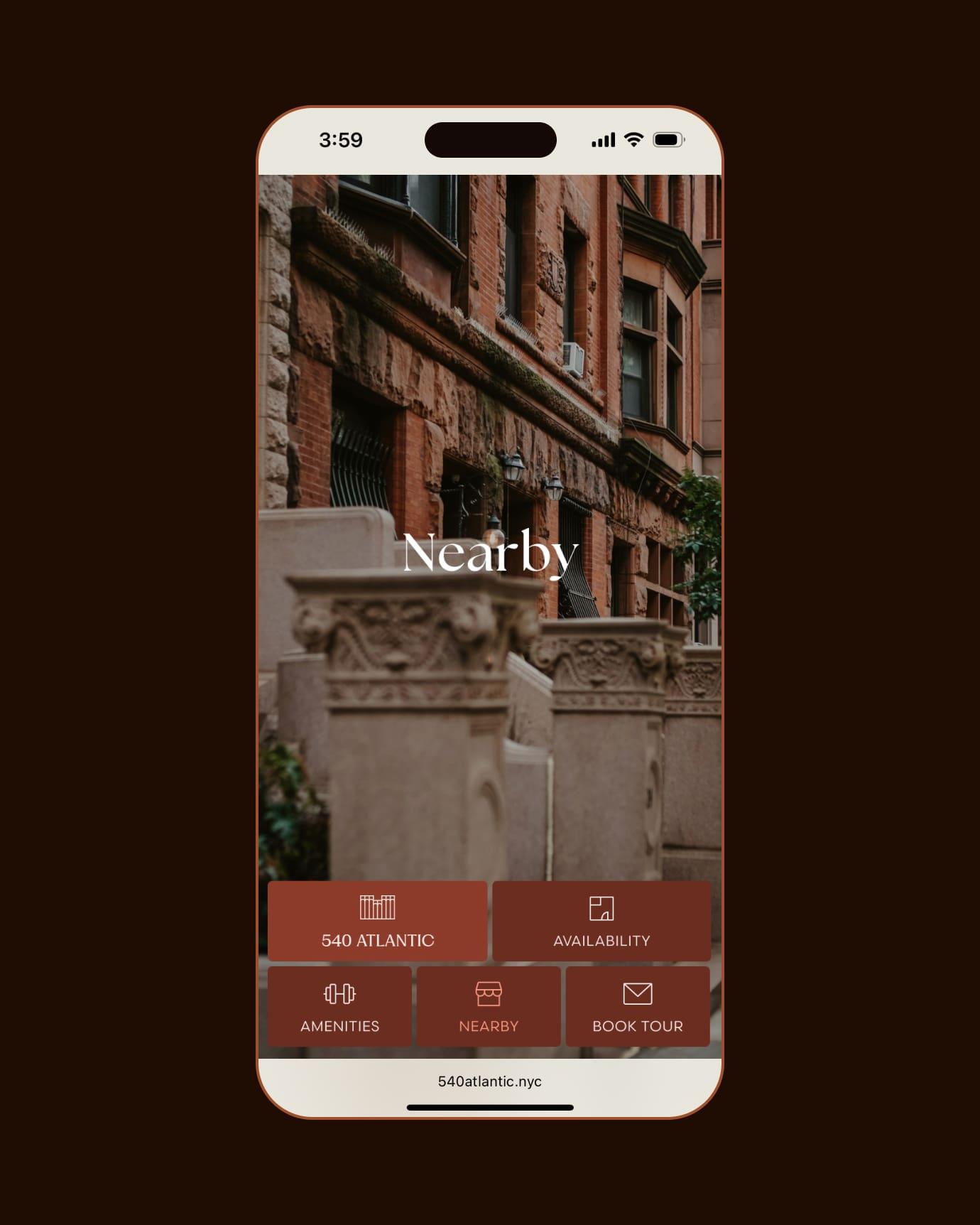
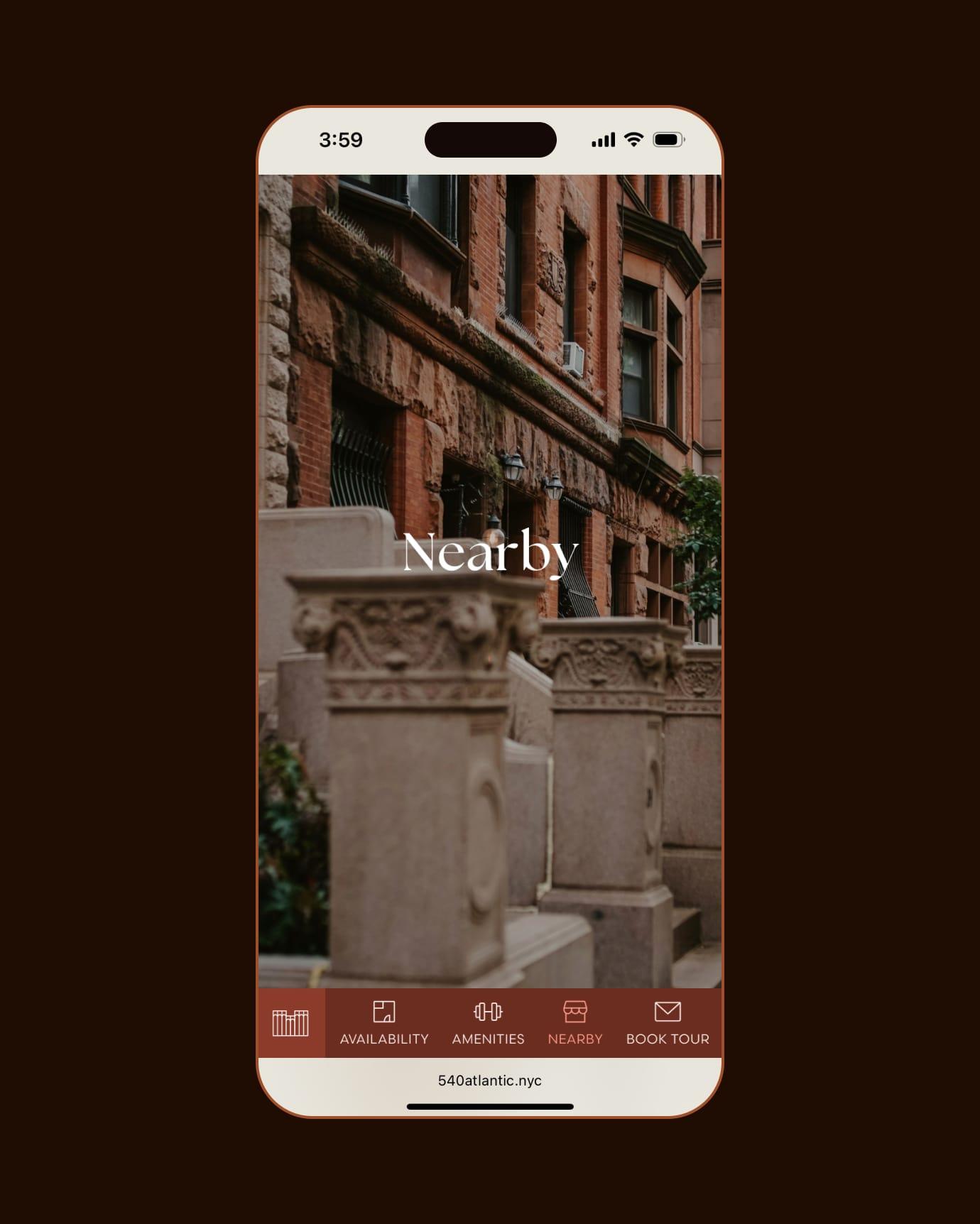
Alongside the bold architecture and curated amenities, the neighborhood is the building’s greatest selling point. This is why it needed its own stage. We crafted a narrative-driven module with 8 reasons to move in the neighborhood as small animation as the user scrolls showcasing the lifestyle. The experience inspired by the way people already explore content like reels and stories. As users scroll, images and copy change in sync, creating an engaging rhythm that feels familiar and natural.
WEB DESIGN
Bridging Physical and Digital
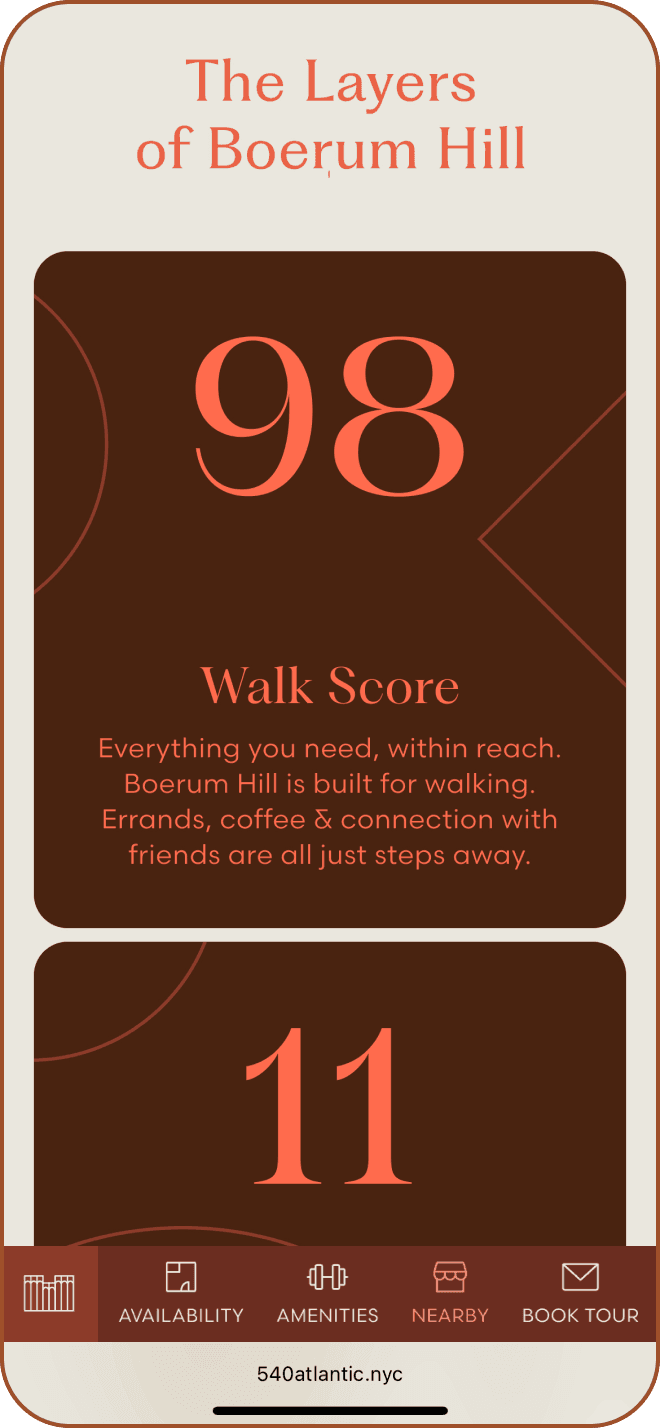
We embraced an unconventional color palette and paired it with geometric illustrations and textures, creating a visual language that’s not just distinctive, but deeply connected to the brand. Every design choice on the site is connected to the building’s identity, echoing architectural elements like the signature staircase. We wanted to celebrate design at every level, digital and physical and the result is a premium experience that celebrates design at every level and reflects the architecture’s bold character.
MOBILE DESIGN
CONTACT
Let’s work together!
